Fermob colours
When we started le petit jardin back in 2003 we were keen to offer some classic French café furniture and a few years later we started working with Fermob, who make some classic café style furniture in a fantastic range of colours – and a lot more as well.
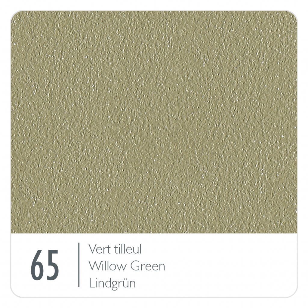
Back then, our customers often chose furniture in a single colour, be that bright Chilli Bistro or a classic 1900 set in Willow Green. Over the years though we’ve noticed a shift and people choosing a more mixed palette of colours, whether that is a mixed set in romantic, soft pastel shades or a bright, even shocking blast of bright colours for a more contemporary, modern setting.
The evolution of colour
The colour range continues to evolve, with new colours added most years, and occasionally some colours retiring. Fermob always introduce new colours in the context of the entire range; with this in mind, many colours can be mixed, either in pairs, three ways or more.
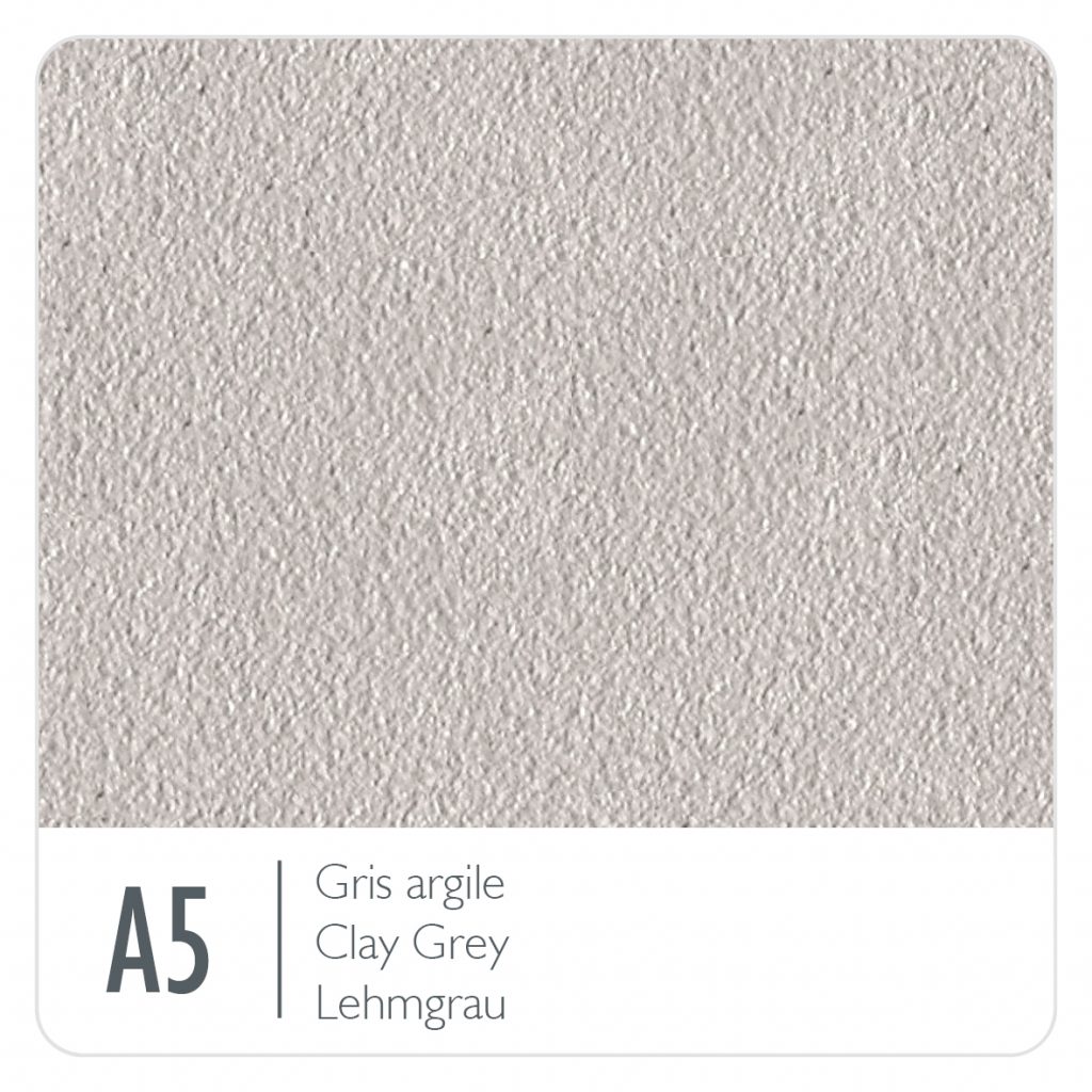
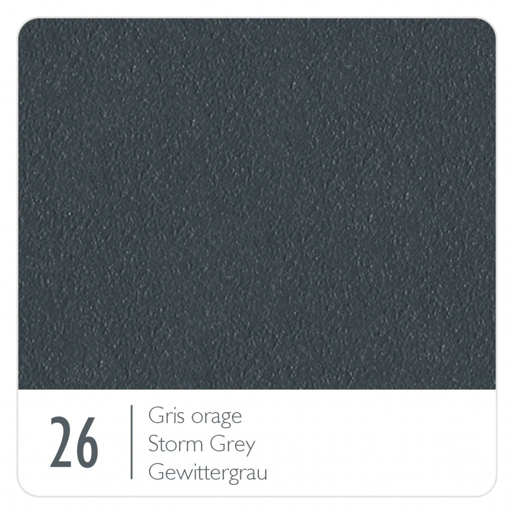
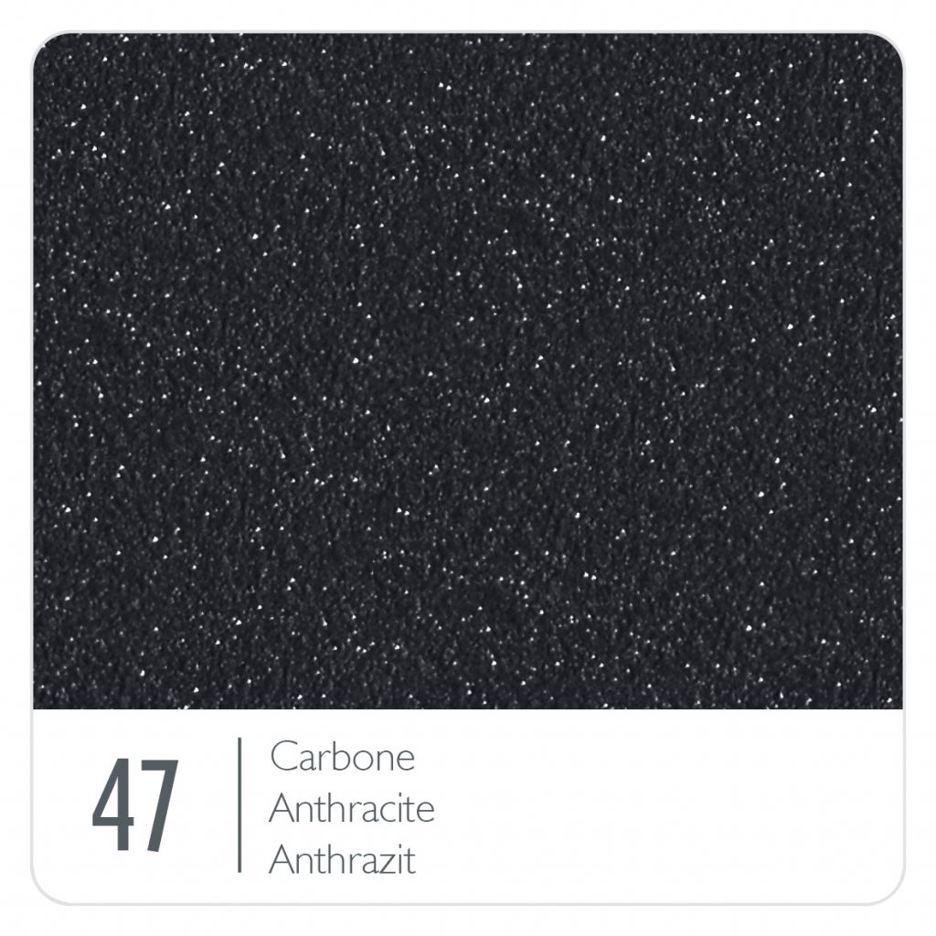
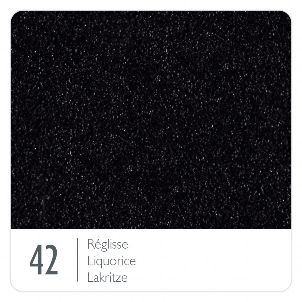
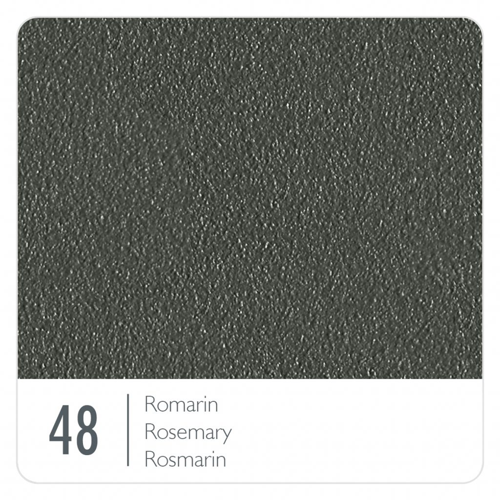
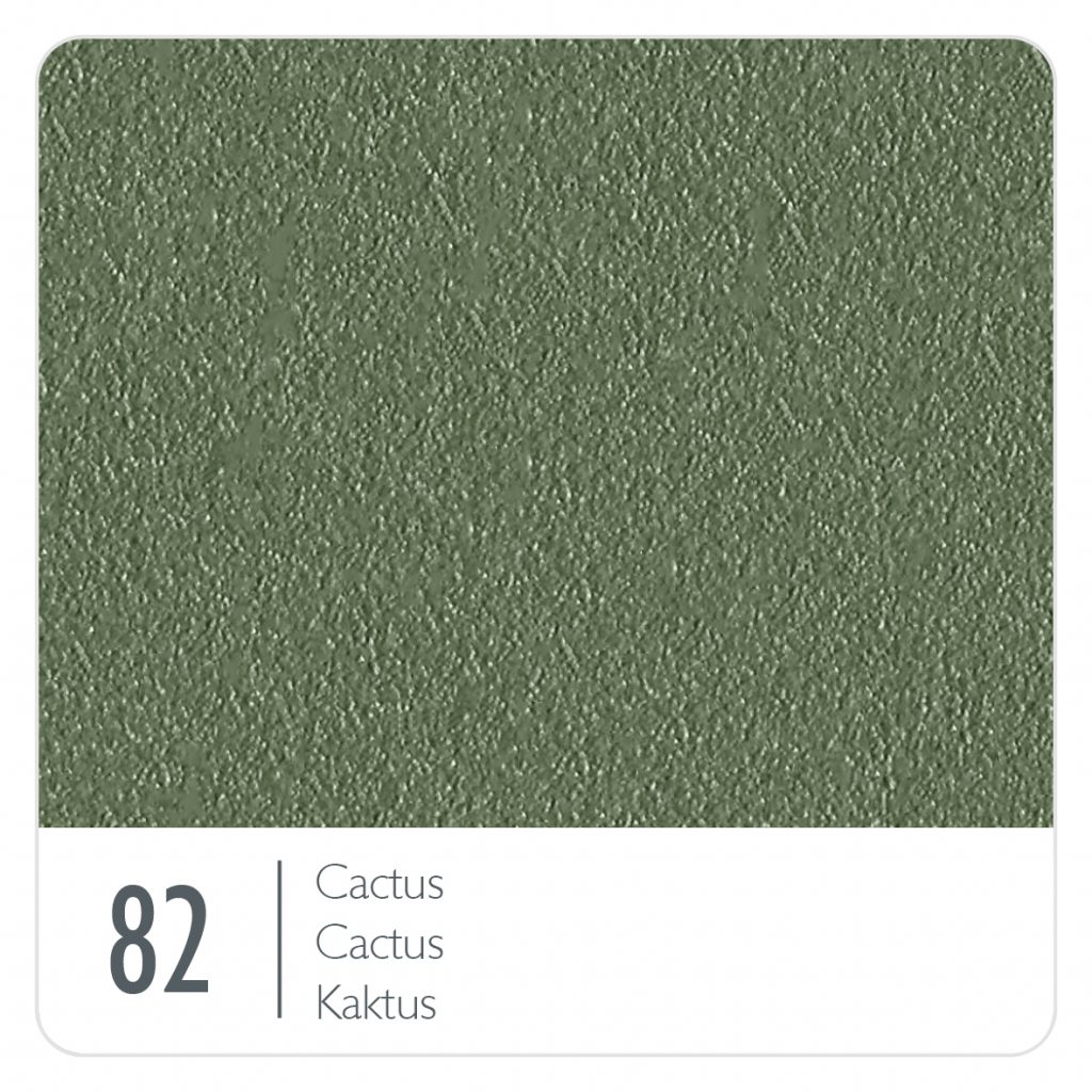
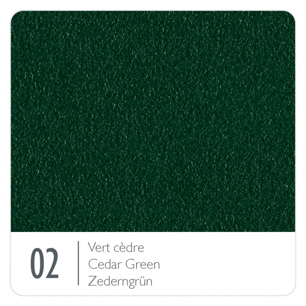
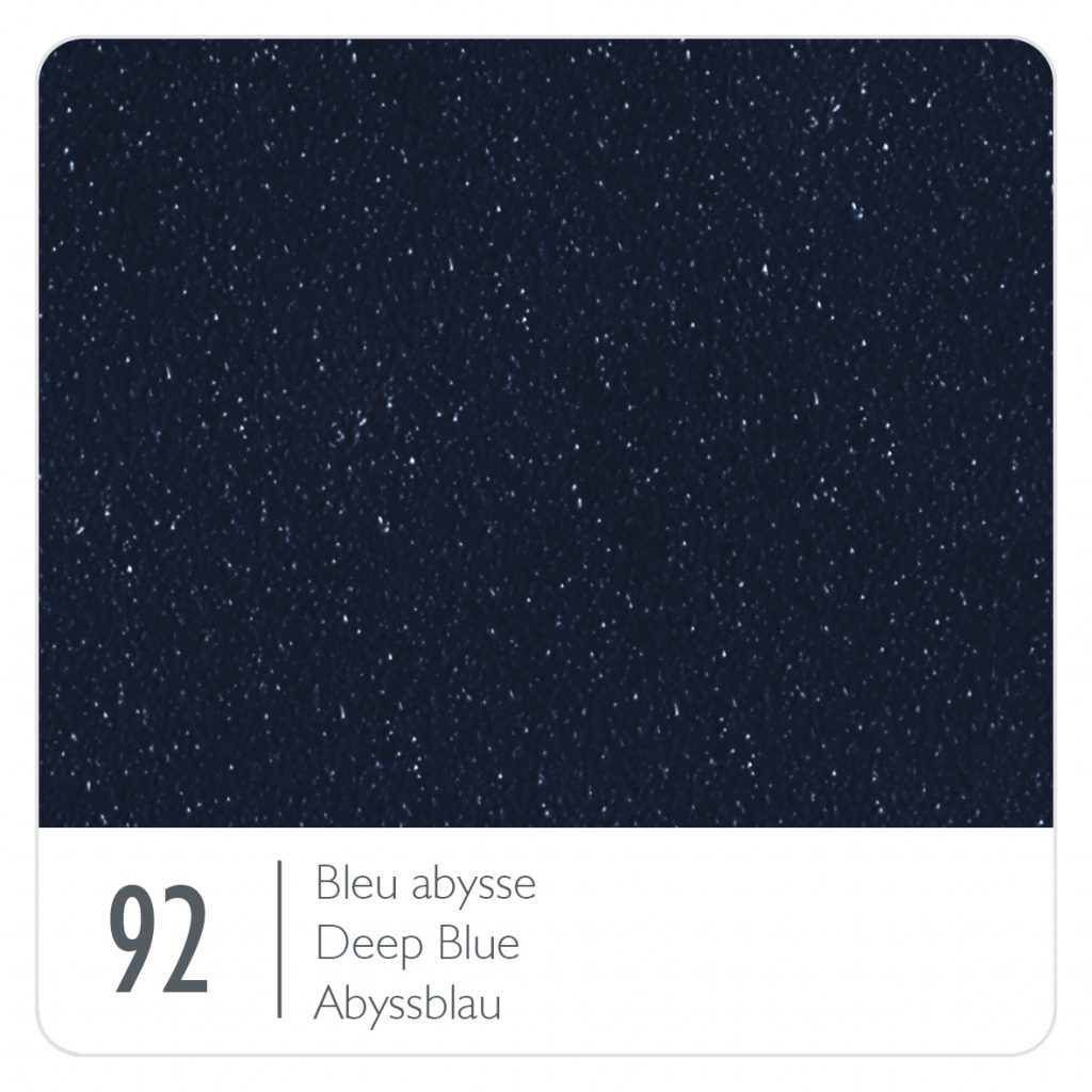
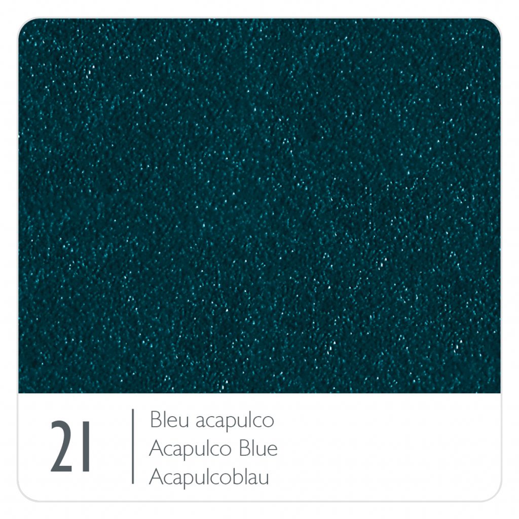
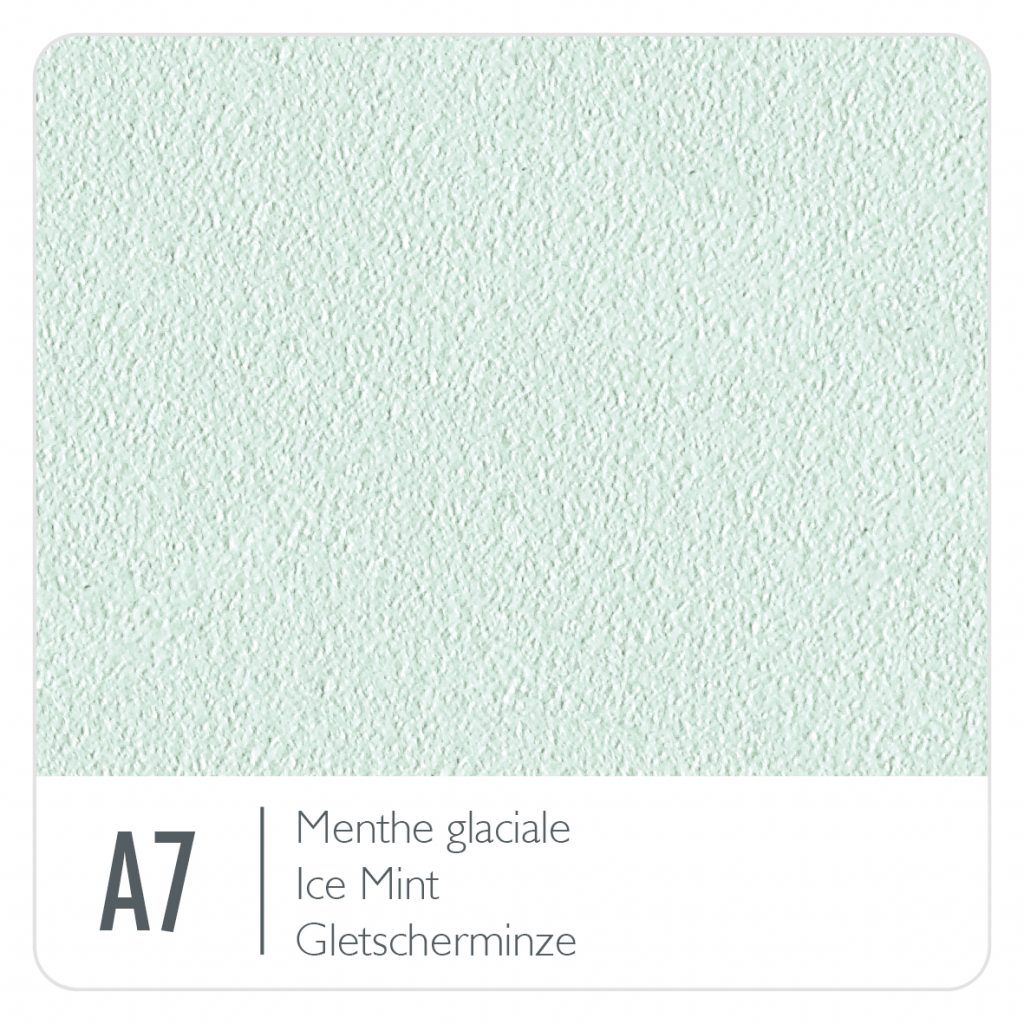
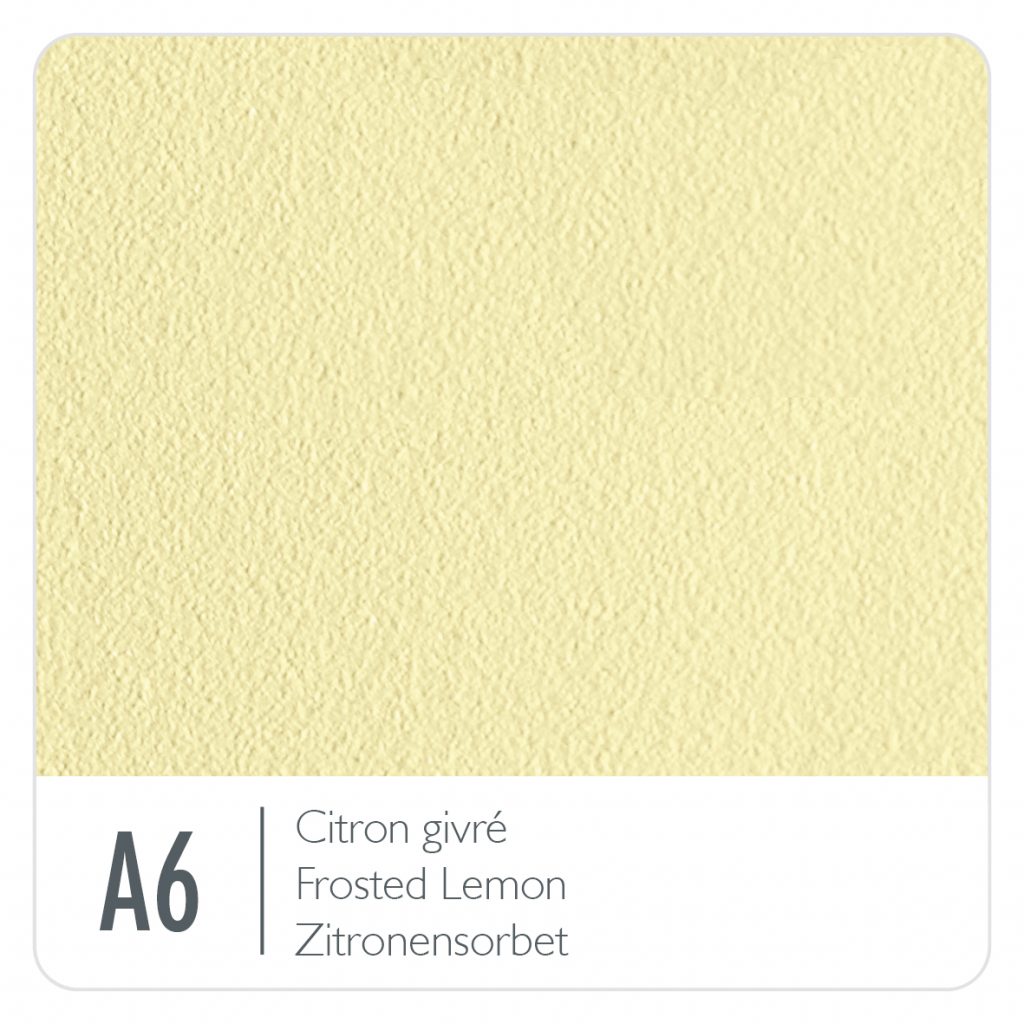
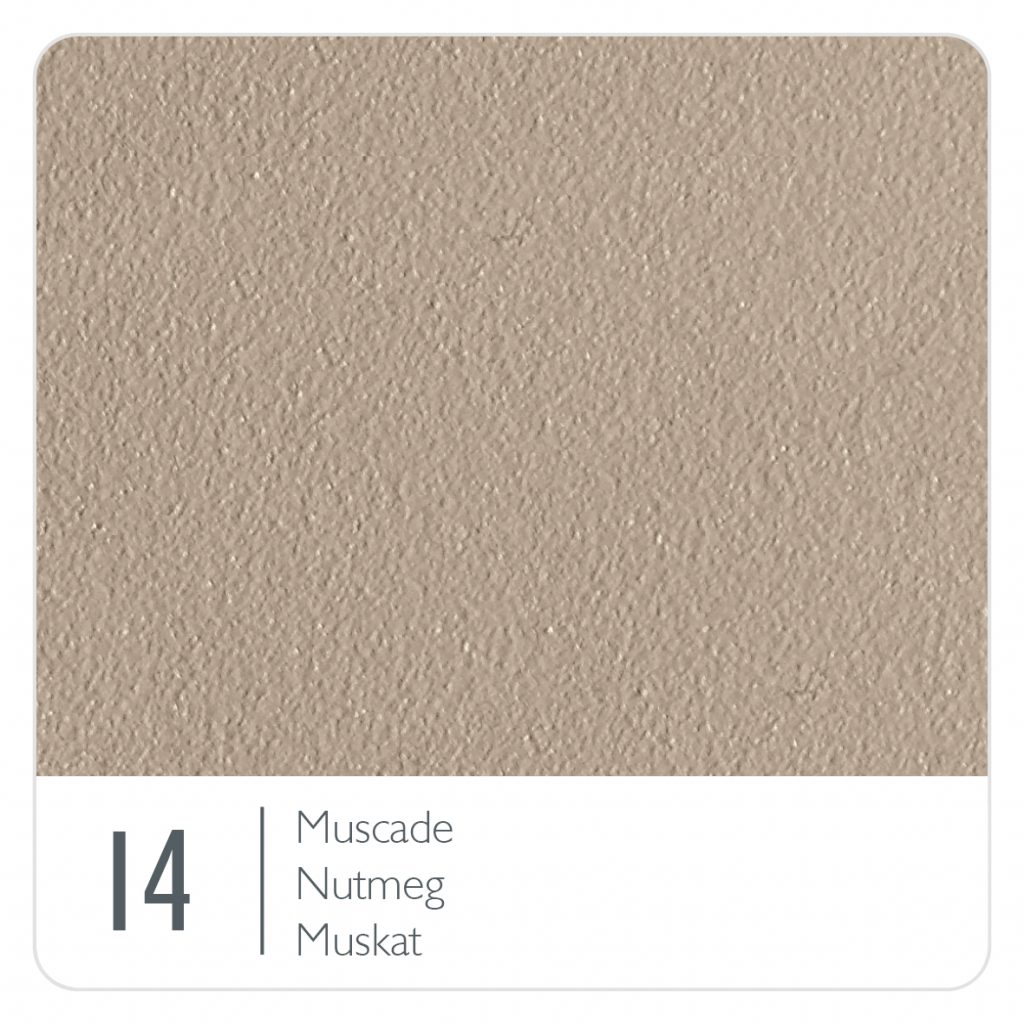
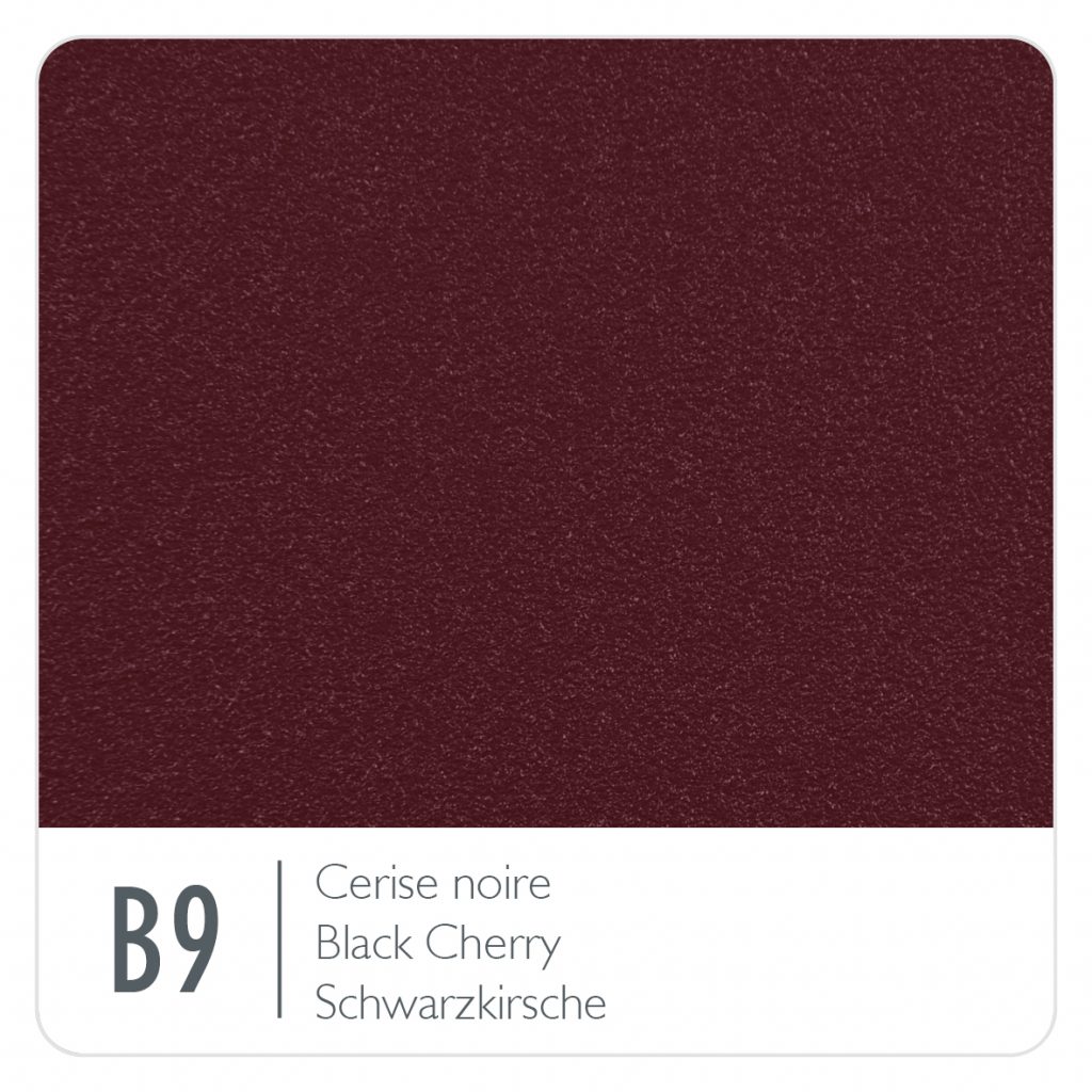
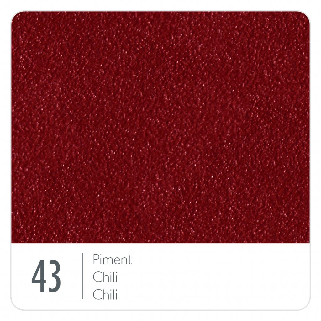
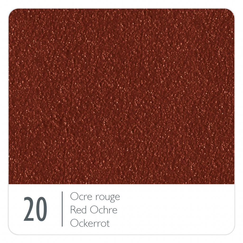
Below, we’ve displayed the current range of colours; clicking on any of the colour swatches will take you to another page with more detailed information on that colour, including some suggested combinations for mixing them up with other colours.
And please click here to browse the range of Fermob we have available.
If there is anything you’ve seen on Fermob’s website that you can’t find here, please get in touch as we may not have added everything to our website and we are more than happy to discuss and explain the range.
The 2026 colours
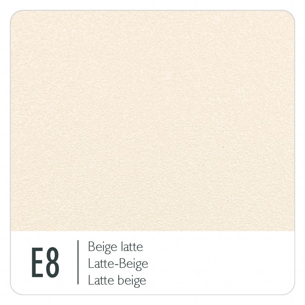
For 2026, Fermob is offering a choice of twenty-five metal colours in its chart, but with some tweaks to the choices.
Of these, eight are available in fabric colours, their Outdoor Technical Fabric (OTF), although not all ranges incorporating fabric are available in all the fabric colours. Please see the individual ranges and items for the exact choice of colour.
The new colour for 2026 is Latte Beige (E8).
They have also discontinued one of the colours, and this year we say farewell to Lapilli Grey (C7).
Click any of the coloured boxes to see more information about that colour and suggestions for combining it with other colours.


How to choose the right Fermob colours?
A few tips to avoid making mistakes
- Define a dominant tone and use it for the table.
- Preferably a neutral tone that you will never tire of.
- Repeat the table colour on a few chairs.
- To create a harmonious set, use the same-colour seats at the end of the table.
- Use same-colour tones to create a play on shades.
- Define a hue: red, blue or green… and combine them. A monochrome combination will create visual appeal.
- No more than three colours in a set.
- Perfect for creating a personailsed universe that matches the environment.
- Go for a 100% monochrome look.
- Are you a big fan of a colour in particular?
About the finish of the paints
Fermob furniture is finished with an exceptionally durable powder coating process.
We’ve made a page with a little more information about the paint finishes here.
Colours and fabrics
Fermob also make extensive use of the colour palette across the fabrics in the furniture collections. See here for more information.
The full Fermob collection
We haven’t counted them, but we think there are somewhere in the region of over 2,500 products in the full Fermob range when you consider all the possible combinations of products and colours.
Please click here to browse the range of Fermob we have available.